E-Commerce•30 Min
20 Best Shopify Apps to Increase Sales in 2026 (Tested & Reviewed)
Written byRishi Thacker
Posted onMar 02, 2026
When you visit a store, how easily you find what you're looking for can make or break your shopping experience.
Just like in a physical store, if customers can't easily find what they need, they’re likely to leave without making a purchase.
In the world of online shopping, the layout and organization of your website—known as navigation—play a vital role in keeping visitors engaged and driving them toward a purchase.
Poor navigation can lead to lost sales, while an intuitive layout can increase customer satisfaction and boost your bottom line.
So, it's not just about looking good; it's about creating a smooth path for customers to follow from the moment they land on your site to the point of purchase.
In this blog, we'll explore how effective e-commerce store navigation can highly impact conversion rates. We’ll get into;
Ensuring that your online store is as welcoming and easy to navigate as your favorite local shop.
By the end, you’ll have a clear understanding of how to optimize your website’s navigation to turn casual browsers into loyal customers.
Why is the navigation of a site given so much importance?
Let’s find out why!
Clear, intuitive navigation creates a positive first impression, helping visitors quickly find what they need.
Good navigation improves user experience by reducing frustration and making it easy to access information, leading to longer site visits and lower bounce rates.
Streamlined navigation guides customers smoothly through the purchase process, which increases the likelihood of conversions and sales.
Well-structured navigation aids in search engines' better indexing, improving site visibility and organic traffic.
Easy-to-navigate sites enhance consumer experience and encourage repeat visits and loyalty.
Aren’t these reasons enough to work on optimizing your website’s navigation?
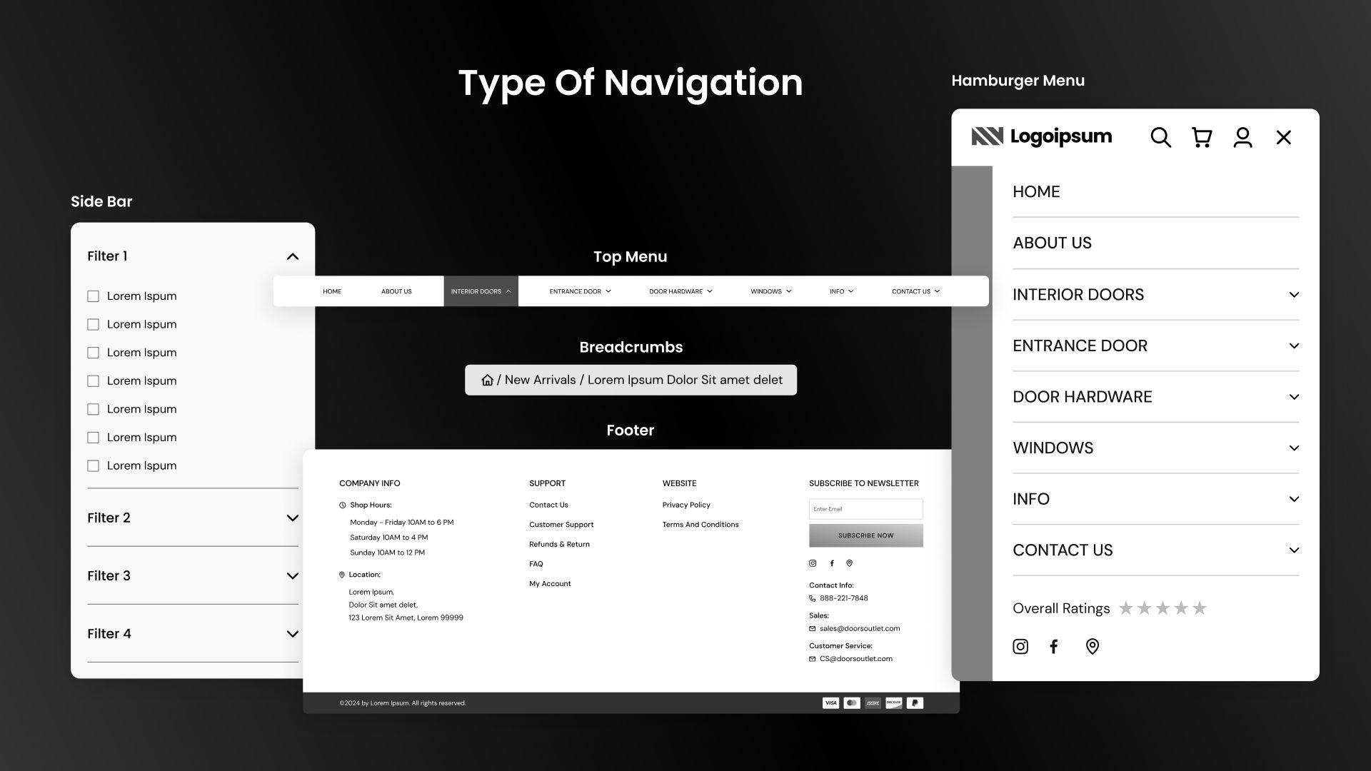
Before diving into how to fix common navigation issues and improve your site's performance, let's first explore the five types of website navigation. Understanding these types will give you a solid foundation for making informed decisions about your site's navigation structure.
Website navigation aids visitors to find the information they need quickly and easily.
Good navigation can lead visitors to valuable information and even convert them into customers.
Here are the five common types of navigation mentioning the best website navigation examples;
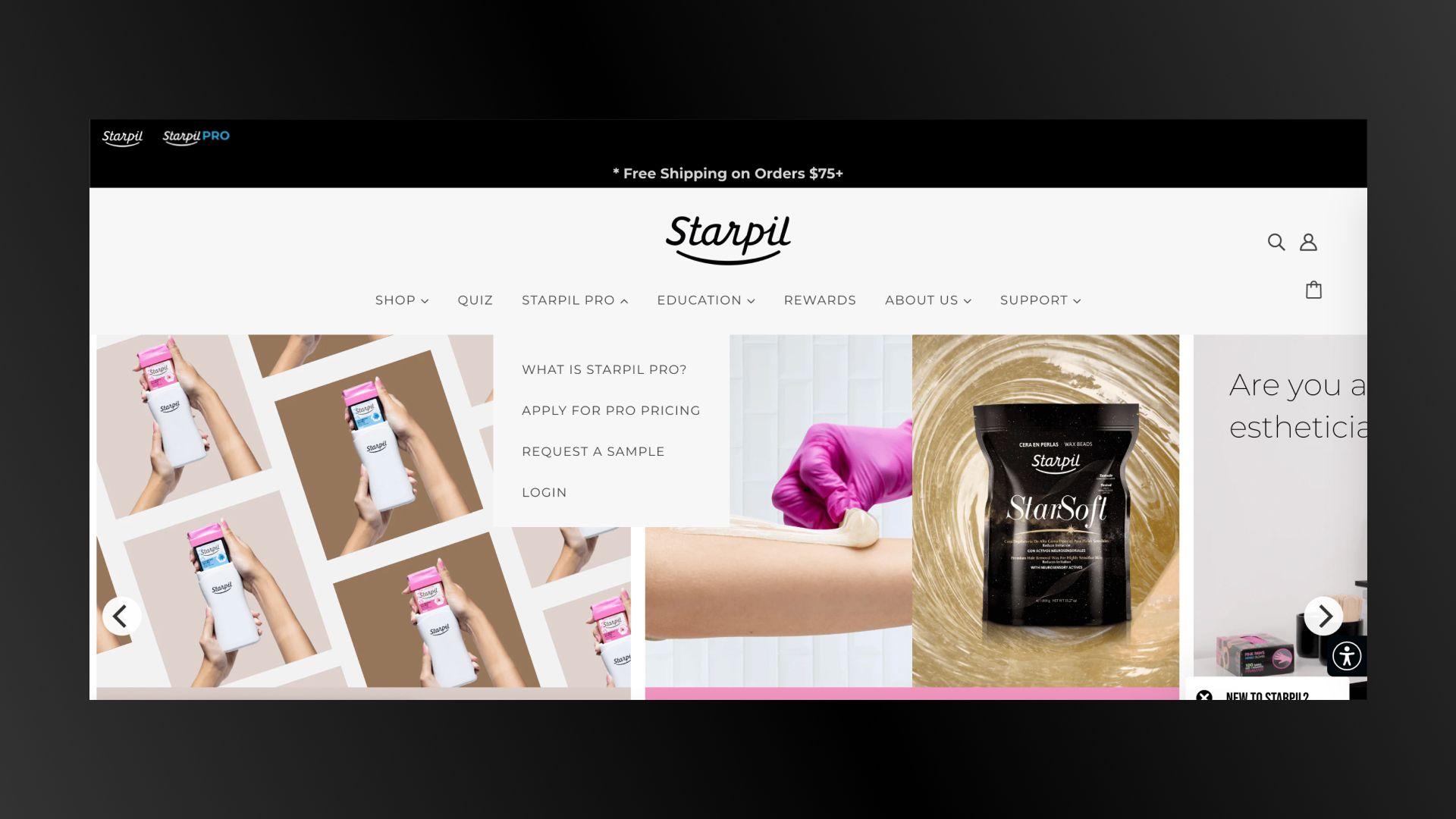
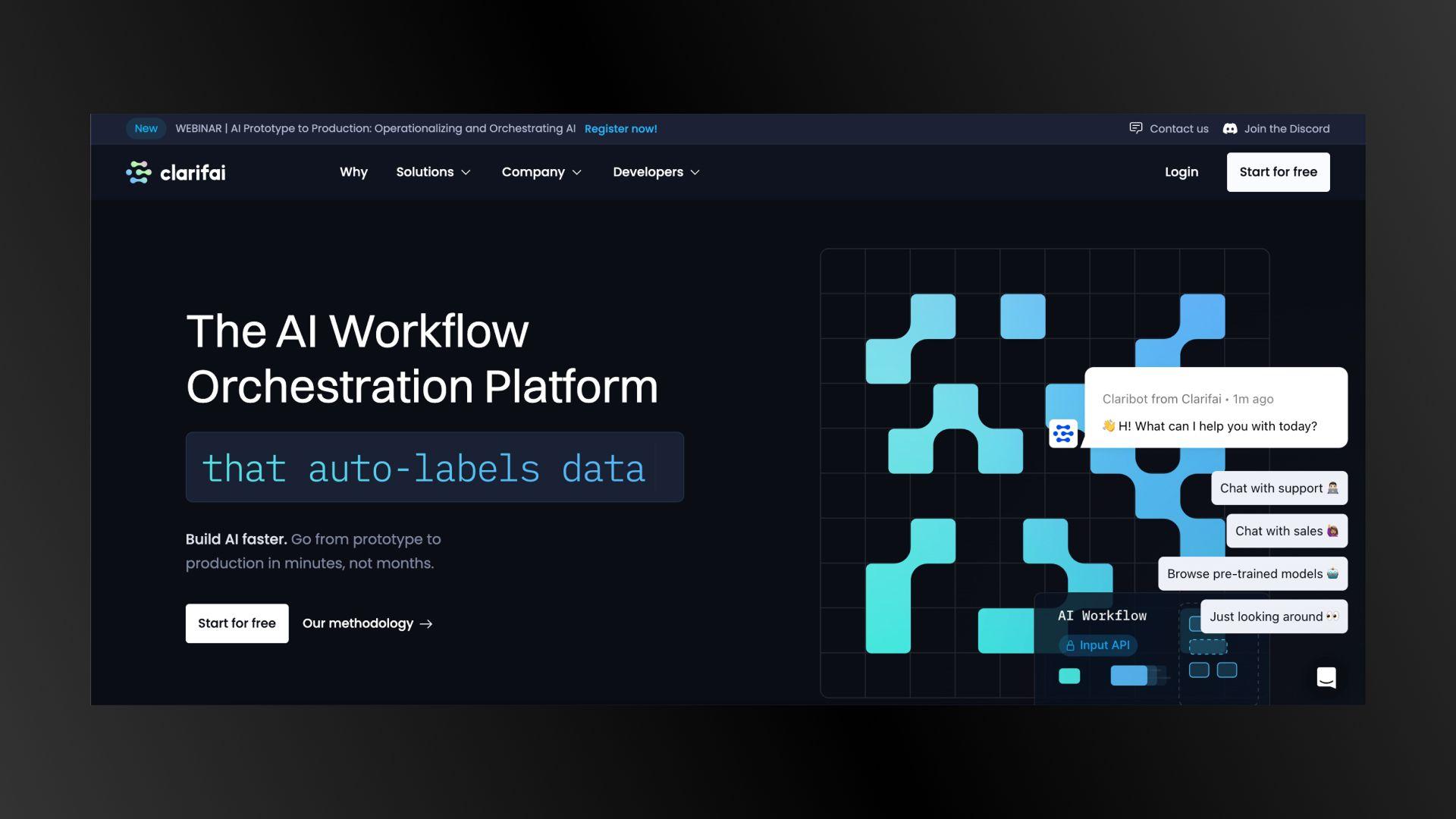
A horizontal bar at the top of the web page that lists the main sections. Often pinned to the top, visible while scrolling, and includes drop-downs for more sections.
It is common due to the F-shaped reading pattern of web pages.

Example: A site with sections like Home, Solutions, Company, and CTAs a top bar.
A vertical bar on the left or right side of the page. Presents subcategories and helps filter search results, especially on content-rich sites.
It is typically a secondary menu for navigating within specific categories.
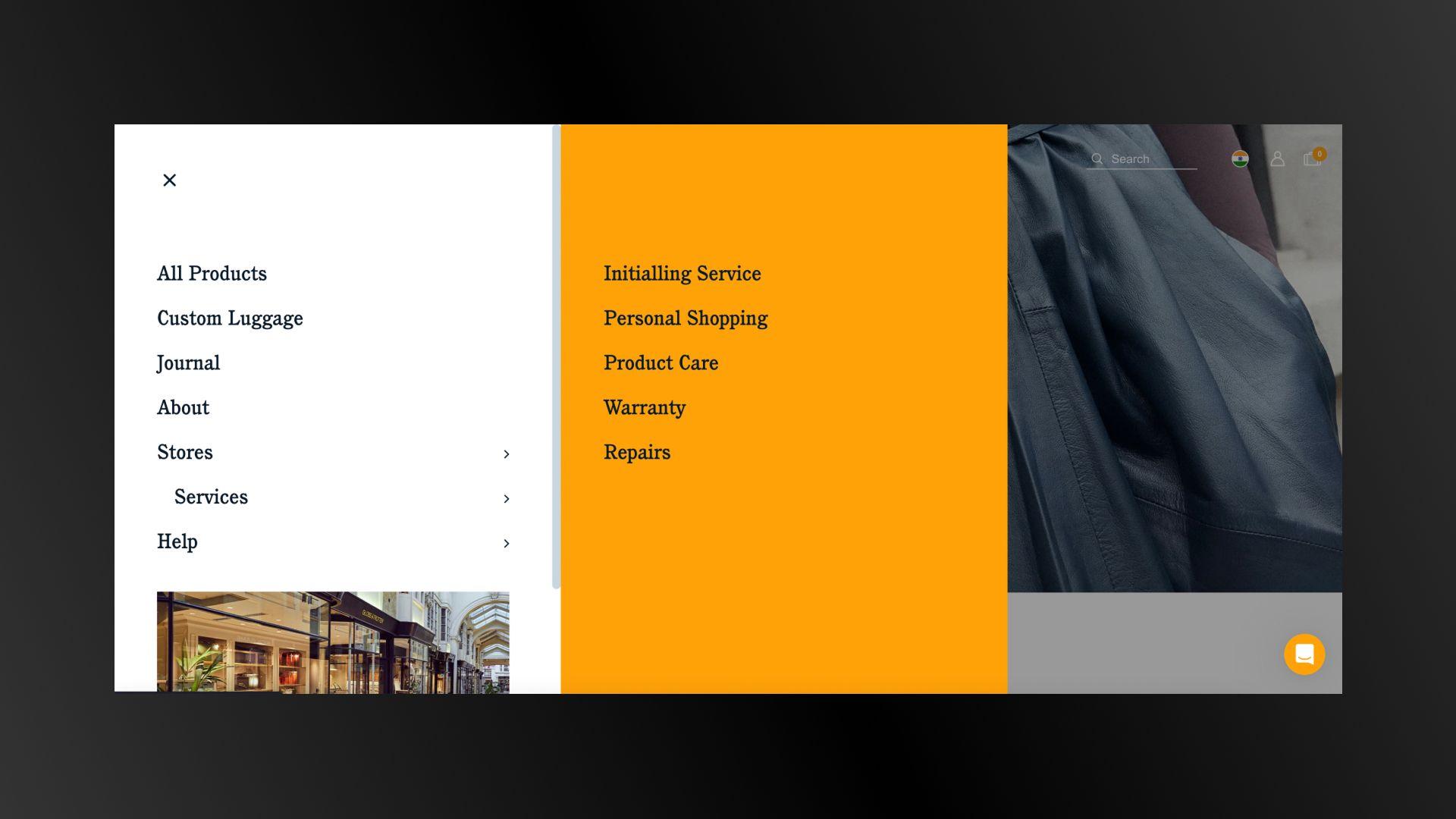
Example: A site with a sidebar menu showing categories like Warranty, Repair, and Product Care.
A navigation bar at the bottom of the webpage. It also includes quick links to conversion pages and secondary calls to action.
It provides additional links not in the main navigation.
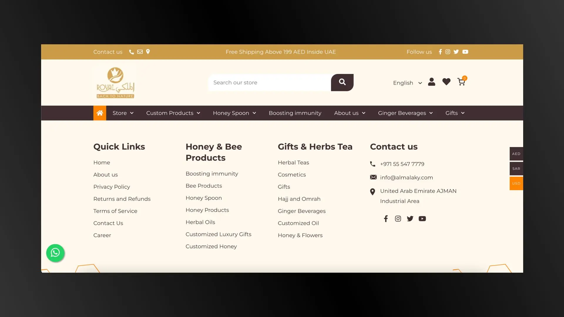
Example: A link to the Privacy Policy, Terms of Service, and Contact Us at the bottom of a page.
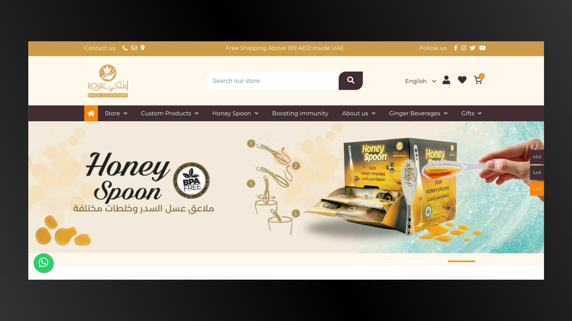
What are Breadcrumbs?
A trail of links showing the way a user took to get to the current page. It is useful for websites with deep hierarchies and subcategories.
It allows users to understand their location within the website and navigate back to previous sections.
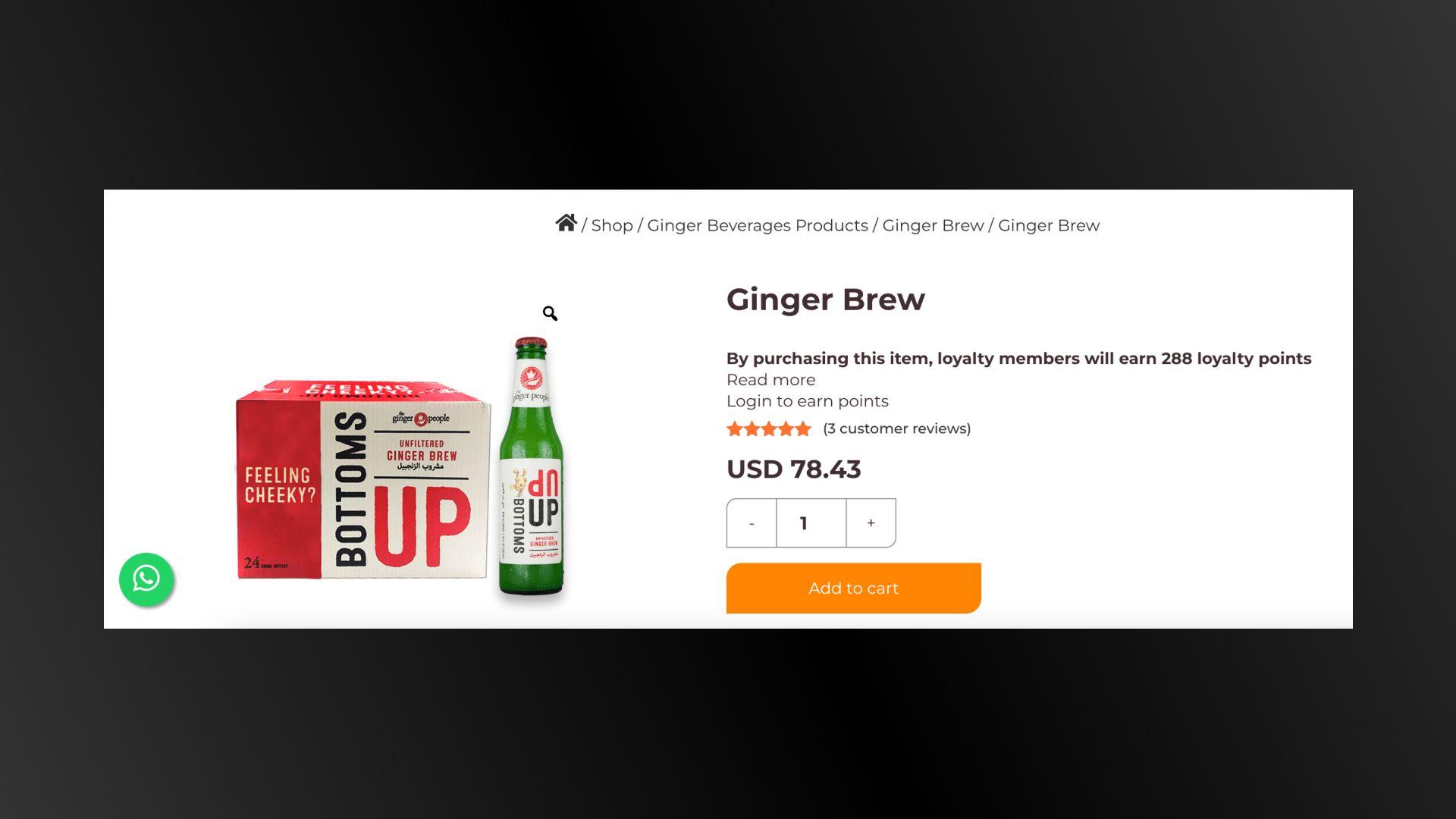
Example: Shop > Ginger Beverages Products > Ginger Brew.
An icon with three horizontal lines expands into a menu when clicked. It is a navigation-on-demand icon that expands only when needed.
It is common in mobile-first web design to save screen space.
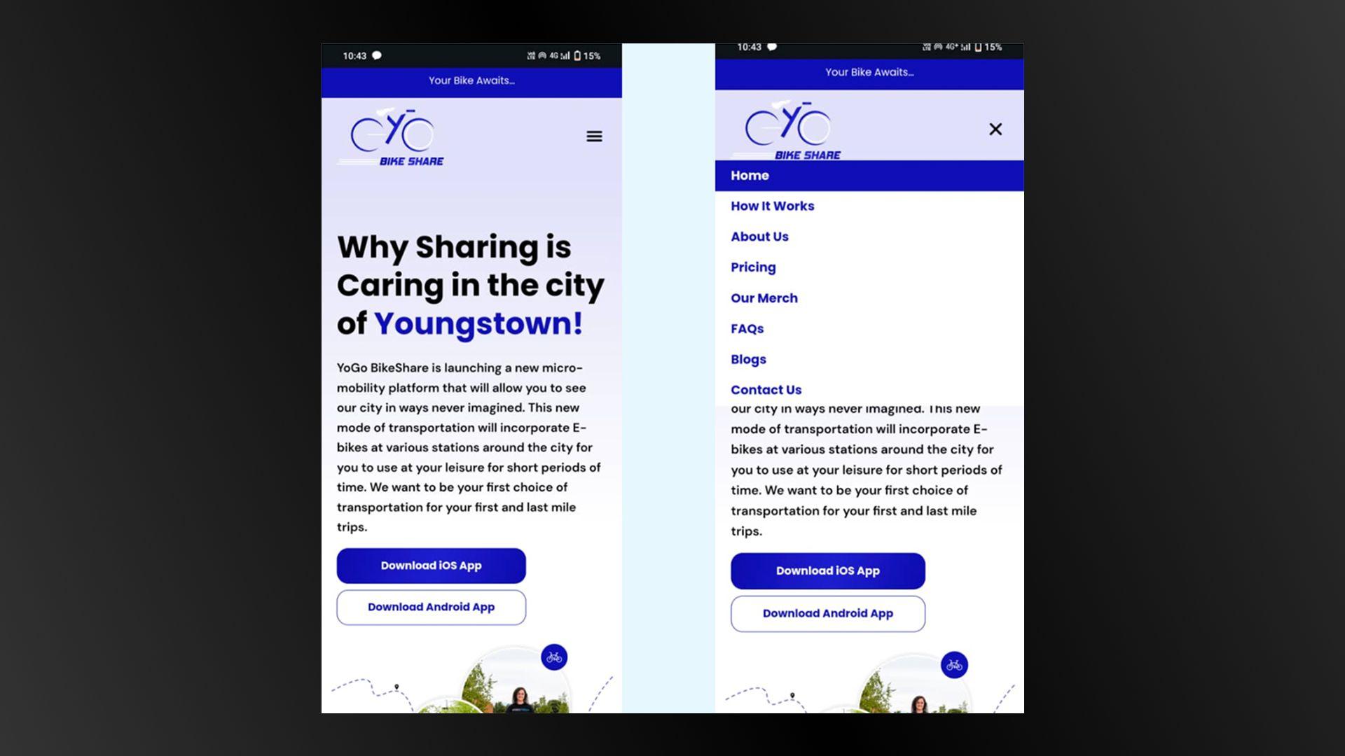
Example: A mobile site with a hamburger icon that opens to reveal links to How It Works, About Us, and Pricing.
By using one or more of these navigation types, you can create a user-friendly website that guides visitors to the information they need, increasing the likelihood of conversions.
Now that we've covered the fundamentals of site navigation, it's time to dive deeper into some of the common mistakes that many e-commerce sites make.
Poor navigation can frustrate users, increase bounce rates, and ultimately hurt your conversion rates. But don’t worry—every problem has a solution.
In the following sections, we'll explore these frequent pitfalls in detail and provide practical strategies to fix them. By addressing these issues, you can create a smoother, more pleasant experience for your customers, leading to higher satisfaction and better sales.
Navigation items are not immediately visible, which frustrates users and increases the time it takes for them to find what they need.
Fix:
Labels like Products/Services don't provide specific information, making it hard for users to understand what they will find.
Fix:
Overloading users with too many choices can lead to confusion and overwhelm. This can negatively affect their experience and your conversion rates.
Fix:
Navigation items are ordered haphazardly, making it hard for users to find important information quickly.
Fix:
Drop-down menus are poorly structured, with too few or too many items or vague labels, which can confuse users.
Fix:
Navigation items and call-to-action buttons look too similar, leading to user confusion.
Fix:
Navigation elements are not optimized for mobile devices, which results in a poor user experience.
Fix:
These fixes are easy and quick, but many sites fail to implement them and eventually lose their customers.
Don't make the same mistake.
Addressing these common navigation issues can enhance consumer experience on your website, leading to better conversion rates. This will ultimately benefit both your users and your business.
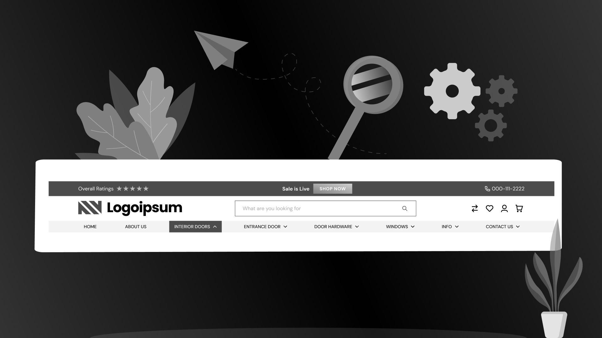
What acts as the gateway to your content and the first point of interaction for visitors?
Never underestimate the importance of the header.
The header is the first thing visitors see.
You have only a moment to gain their trust and convince them to stay.
That’s why;
Use visitor behavior data to determine what additional items to include in the header.
Test different elements in the header, such as promotional banners, and analyze the results.
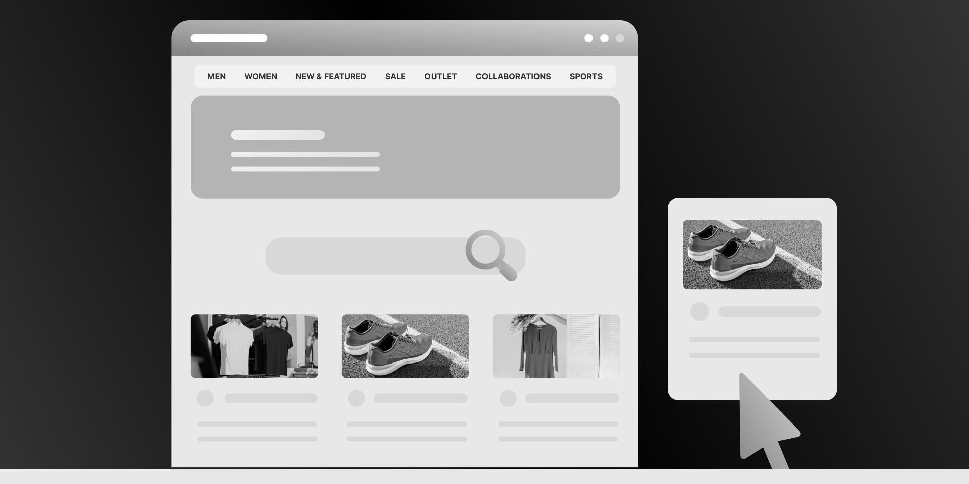
A prominent search bar draws users' attention immediately, making it easy for them to start searching without having to look for the search function.
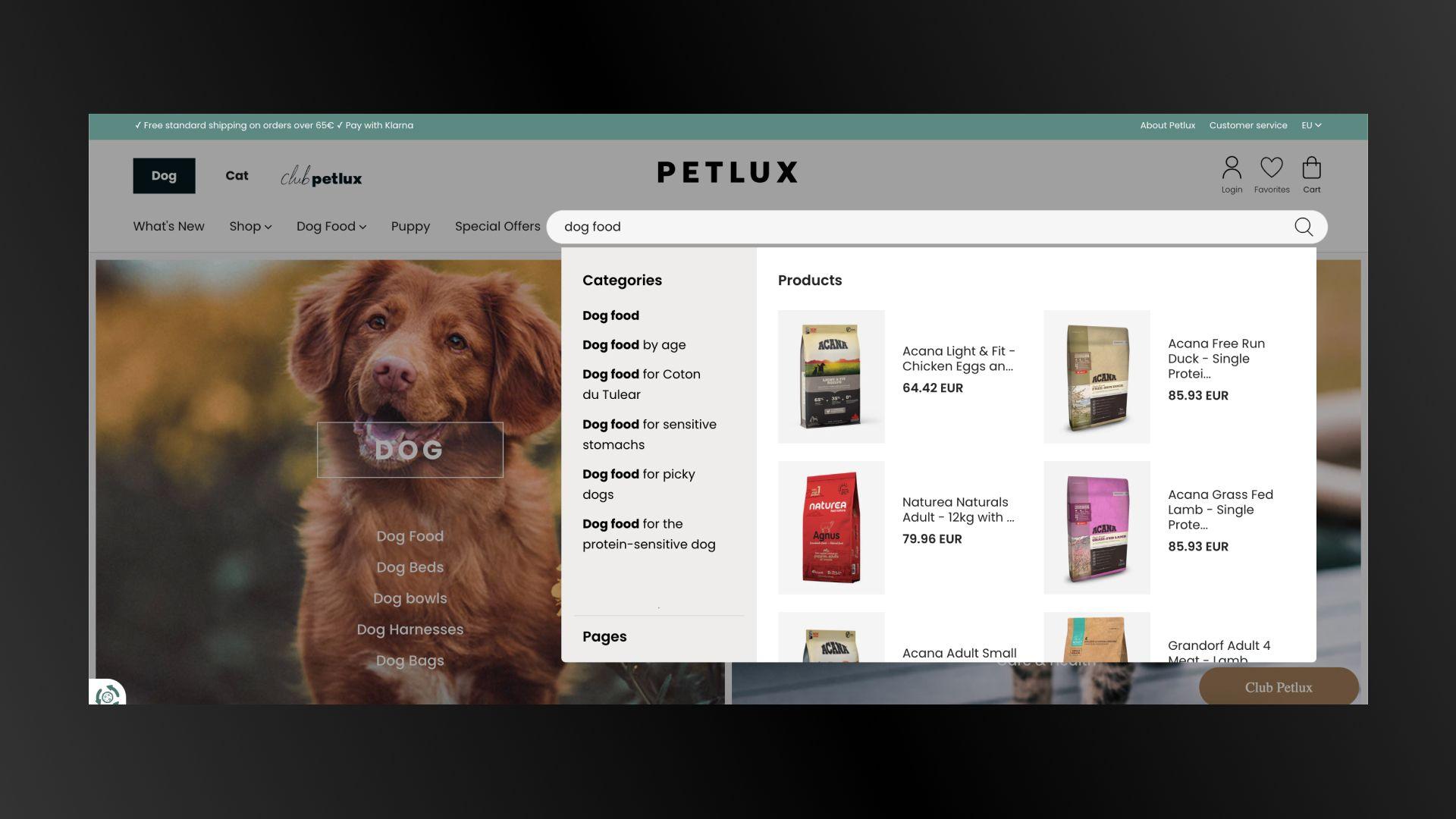
Investing time and resources into perfecting the search bar can pay off in terms of user satisfaction and revenue growth.
Simplified navigation on mobile devices improves the user experience by making it easier to browse on smaller screens, which is essential given the increasing use of mobile devices for online shopping.
What you can do is;
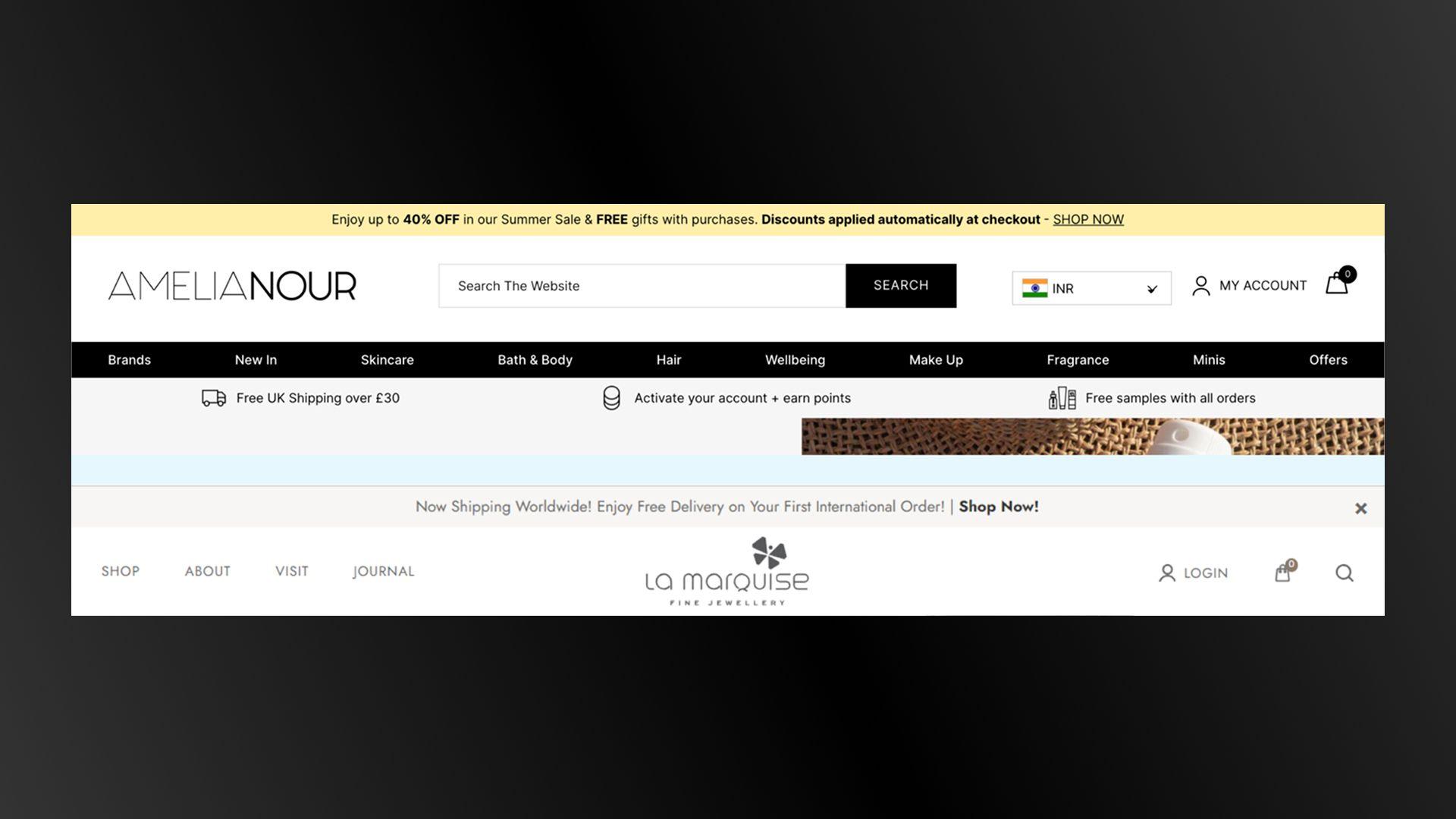
A site-wide benefits bar is an excellent tool to communicate your USP to visitors immediately. Placed below the header, it can effectively highlight key benefits and offers, enhancing user experience and driving conversions.
The benefits bar serves as a quick reference for visitors to understand what sets your store apart. It can build trust and encourage users to explore your products further.
Example:
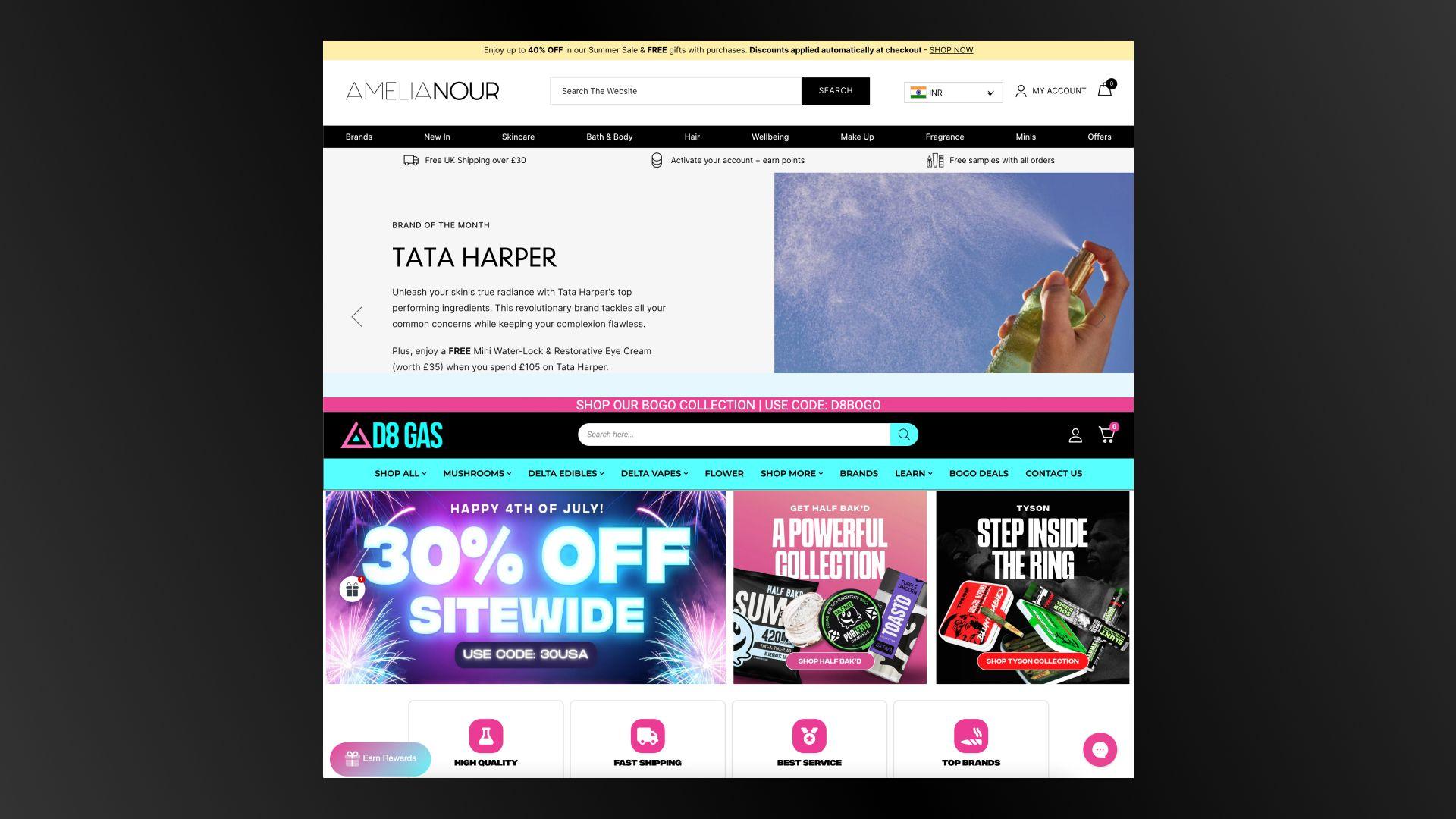
Take inspiration from successful brands like D8 Gas and Amelia Nour and make your benefits bar a prominent feature of your site.
An intuitive navigation structure reduces the time customers spend searching for products, minimizes frustration, and increases the likelihood of making a purchase.
What you can do is;
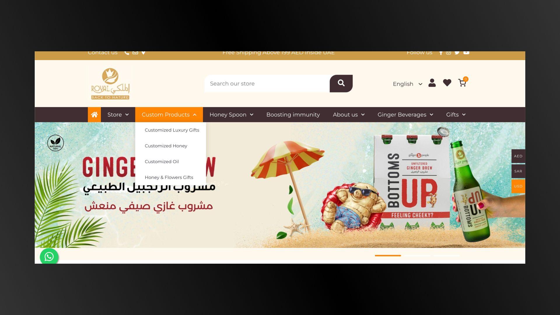
For instance, if you sell jewelry, you might have parent categories like Rings, Bracelets & Pendants, and Earrings.
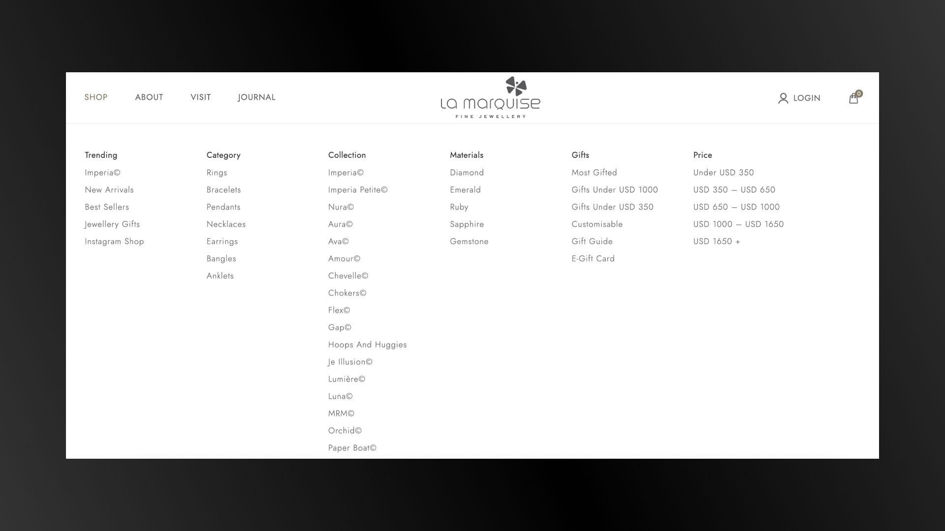
Mega menus are an excellent solution for e-commerce sites with large inventories. They allow you to organize numerous categories and subcategories in a user-friendly manner.
Some of the mega menu examples include Walmart which organizes products into main categories like Books, Electronics, and Clothing. Under each main category, subcategories such as E-Readers & Accessories, Computers & Tablets, and Women’s Fashion are listed.
A New Arrivals tab highlights the latest products, attracting customers who are interested in new items and keeping your inventory fresh and engaging.
What you can do is;
By following these guidelines, you can create a header and navigation system that improves consumer experience and increases conversions.
Remember, a well-thought-out navigation structure is not just about aesthetics; it's about functionality and making sure your visitors can effortlessly access the information and products they need.
Review and update your navigation elements regularly to adapt to changing customer preferences and advancements. By doing so, you create a better shopping experience that meets your customer's needs and keeps them coming back.
We believe in the power of optimized navigation. We understand that a well-structured, intuitive navigation system is key to increasing conversions and customer loyalty. If you’re looking to improve your website’s navigation or need assistance with any other aspect of your e-commerce site, don’t hesitate to reach out.
We're here to help you create a seamless, enjoyable shopping experience for your customers.